The process of create my first Mobile App with AngularJs & PhoneGap

meeting-time-cost_detail

March 1, 2014: Thinking about the new App

Lately I’m feeling a little bit outdated in my job, because some of the new company projects are based on technologies which I’ve never used before like:

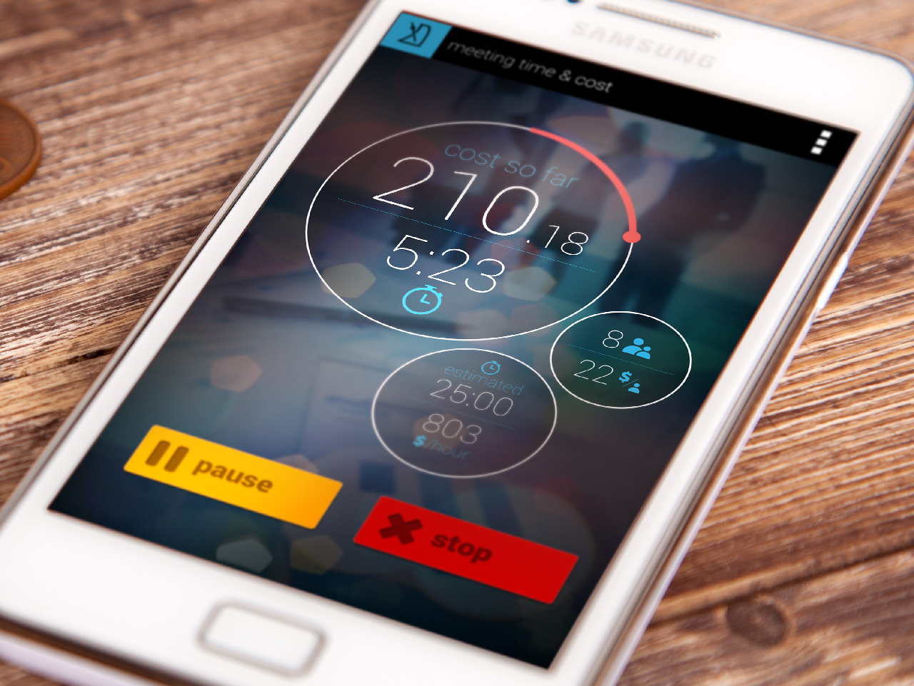
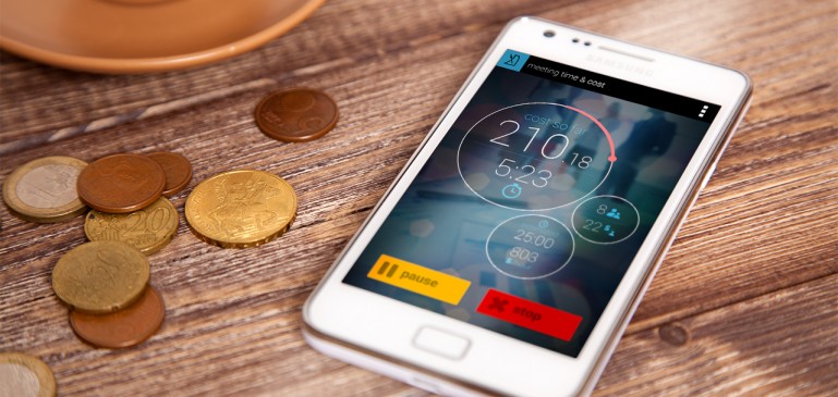
That’s why I want to start a new personal project base on some of those technologies, to learn to use them and became a better front-end developer. After thinking some days about it, I’ve decided to create a Mobile App to check the money that a meeting is costing, based on the amount of people in the meeting and theirs salaries. I choose this app because:

  • Although this idea is no new at all on the markets, I didn’t found a nice app to do this task, at least on Android, all of them are ugly (in my opinion, of course), so I think I can create a better and nicer app.
  • It’s quite easy to develop, so I can focus on learning the new technologies, instead of wasting time in doing other kind of things.
  • I will use it, and I also  hope other people will do. My company, Paradigma Tecnológico,  it’s a fabulous company to work in , but like most of companies has a lot of meetings everyday. I know meetings are necessary, but I hate when a meeting take to long and people start talking about things not related with the meeting´s topic. I hope this app can make people try to finish earlier their meeting, saving money for the company, and time for their employees.

It will be an hybrid app (one app that can be install on IOS, Android, Windows Phone,… without the need to make a source code for each platform) compile with PhoneGap. I choose PhoneGap because:

  • It is easier and faster for me. I’m a front developer, so I feel very comfortable with HTML, JS & CSS.
  • I think  learn PhoneGap will be more useful for my job that learning native code (IOS or Android). My company is full of great developers that can code much better than me native apps.
  • This App is small and it doesn’t use phone specific capabilities, so I hope that it would be as efficient with PhoneGap that with native code.
  • Get more devices with less effort. I’ll create just one app, but almost everyone will be able to download it and use it.
  • I want that the app also can be accessible through the web browser. PhoneGap uses standard technologies like HTML, CSS and JavaScript, so the app must be able to run as a web page.  So people will be able to use it with out the need of download it and install it on their devices.

(más…)

Android no me actualiza las aplicaciones

Ya se que estoy «meando fuera del tiesto» al escribir este post, pero es que me ha costado mucho encontrar la solución a este problema.

Mi Android,  un Samsung Galaxy S plus I9001, desde un tiempo a esta parte no actualizaba ninguna de las aplicaciones.

Me apare que tengo actualizaciones pendientes, y empiezan a descargar, pero nunca llega al paso de instalación.

La solución

Al parecer el problema es un bug que tiene una versión de Google Play market para los terminales de Samsung Galaxy.

Tan solo hay que desinstalar la aplicación de Google Play Store, y reiniciar.

Con este sencillo paso, todo debería de de volver a la normalidad, y por fin poder descargar actualizaciones y nuevas aplicaciones.

Trucos para mejorar resolución de imágenes en móviles iPhone y Android

No sabíamos muy bien por que las imágenes de nuestras aplicaciones web no se veian 100% nitidas en nuestros terminales móviles, pero gracias al buen artículo publicado en thesedays.com hemos mejorado la resolución de las imágenes en móviles iPhone y Android.

Por defecto, iPhone 4 muestra las imágenes al 200% de su tamaño, ya que su resolución es mucho mayor que la de su hermano pequeño. La solución es duplicar las imágenes de la aplicación al doble de su tamaño y usar una media querie en nuestro CSS que haga referencia a dicha imagen para este tipo de dispositivos.

.myImage {
 height: 40px;
 width: 100px;
 -webkit-background-size: 100px 40px;
 background: url("images/myImage.jpg");
}

@media screen and(-webkit-device-pixel-ratio: 2) {
 .myImage {
 background: url("images/myImage@2x.jpg");
 }
}

Debemos de tener en cuenta dos lineas de este CSS:

  • -webkit-background-size: fuerza al navegador a mostrar la imagen de fondo al tamaño deseado. Aquí pondremos el tamaño de la copia «pequeña». Así la copia grande de la imagen se repesentará al tamaño de la pequeña
  • @media screen and (-webkit-device-pixel-ratio: 2):  Media querie para iPhone 4. Lo que esté desde de las llaves solo lo ejecutara iPhone 4 (o futuros terminaes que tengan un pixel ratio de 2)

¿Y que pasa con los móviles Android?

Vale, haciendo esto todo nos va a ir mucho mejor en iPhone 4, pero que pasa con los Android. Yo tengo un Samsung Galaxy S II, y tenía el mismo problema. También veía las imágenes poco nítidas.

Mi primera solución, ha sido el remplazar la media query del pixel ratio por otra para todos los navegadores webkit (practicamente todos los que se usan ahora en móviles y tablets):

@media screen and (-webkit-min-device-pixel-ratio:0) {
}

Con esto podremos hacer el «truquito» del redimensionado de imágenes en todos nos navegadores webkit.

El resto de navegadores seguirá viendo la imagen pequeña sin problemas.

Estoy empezando utilizar esta técnica, y puede que surjan muchos bugs. Si conocéis algún sistema mejor para resolver este problema contármelo, y lo publicaremos en la web.

Últimos consejos

Tampoco debemos de olvidarnos de otros trucos para mejorar nuestra maqueta en móviles como:

  • Usar la siguiente meta etiqueta:
<meta name="viewport" content="width=device-width, initial-scale=1.0, maximum-scale=1.0, user-scalable=no" />
  • Forzar al navegador a no redimensionar el texto con la rotación de la pantalla
body {
-webkit-text-size-adjust: none;
}
  • definir un ancho minimo de 320 pixels
min-width: 320px