Hacer animaciones con CSS mola, y a día de hoy es algo que todavía no está muy extendido entre los maquetadores. El soporte de navegadores ya es mas que aceptable, y deberíamos de empezar a aplicarlos en nuestras maquetas.
En la última versión de la web de Paradigma optamos por hacer uso de las animaciones CSS en algunas de sus páginas. El caso más significativo es el de la página de contacto o la 404, donde quisimos simbolizar varios grupos de órbitas en movimiento.
Tras hablar con algunos de mis colegas, y darme cuenta de que pensaban que estaba hecho con JavaScript, pensé que podría ser interesante explicar como se hizo (por lo menos no pensaron que estaba hecho en Flash).

CSS transition vs. animaciones de jQuery
El rendimiento es la principal causa para pasarse a CSS para animar objetos. Las animaciones CSS ‘tiran’ de la aceleración hardware de tu equipo, creando animaciones más fluidas. Si alguna vez habéis animado algo con jQuery, habréis sufrido los tirones o retardos en tus animaciones. Esto se acentúa en dispositivos móviles.
Con las animaciones jQuery cada frame de la animación debe de repintar el DOM, y esto es un proceso muy costoso.
«Separation of concerns«: el HTML solo debería de encargarse de la estructura, el CSS de los estilos y los JS de los comportamientos. Entendiendo las animaciones como estilos, parece más correcto que sean los CSS los que se encarguen de estas tareas.
Como principal ventaja de jQuery diré que está soportado por más navegadores, aunque hoy en día el soporte de CSS3 transition es muy amplio. El problema es con IE9 y anteriores.
Así se hizo una de estas órbitas.
Primero crearemos la estructura HTML que más adelante se convertirá en uno de estos grupos de planetas.
<div id="orbitsWrap"/>
  <ul class="orbit">
    <li class="center"></li>
    <li class="planet"></li>
    <li class="planet highlight"></li>
    <li class="planet outline square"></li>
    <li class="planet outline"></li>
  </ul>
</div>
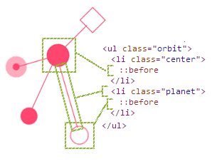
La siguiente imagen la podemos usar como guía, para entender a que parte de las órbitas corresponde cada elemento HTML
Estos son los estilos necesarios para mostrar las órbitas (aunque todavía no estarán animadas)
/*= STYLES ONLY FOR DEMO PAGE */
body, html {
  padding:0;
  margin: 0;
}

/* container dimensions */
#orbitsWrap {
  max-width: 300px;
  height: 300px;
  margin: 0 auto; /* center container */
  position: relative;
}

/* end of demo page */

/*= ORBITS CSS */
  .orbit {
    /* remove default styles of ul tag */
    margin: 0;
    padding: 0;
    list-style-type: none;

    /* set orbit dimensions & position */
    width: 100%;
    height: 100%;
    position: absolute;
    top: 0;
    left: 0;
  }

/*
  · The connection lines are the element themself
  · The rounded elements (the planet) are located
    in the pseudo-element :before
*/

  /* center planet: rest planets orbit CSS */
  .orbit .center {
    /* set position of center planet in the middle
    of the orbit */
    position: absolute;
    z-index: 9;
    top: 50%;
    left: 50%;
  }

    .orbit .planet, .orbit .center:before, .orbit .planet:before {
      position: absolute;
      content: " ";
      /* color for planet and conection line */
      background:#FF466E;
      border-radius: 50%; /* make planets rounded */
    }
      /* The connection lines */
      .orbit .planet {
        top: 50%;
        height: 1px;
        border-radius: 0;

        /* default position and size for a planet */
        /* it'll be overwrite for the rest of planet */
        left: 25%;
        width: 35%;
      }
        .orbit .planet:nth-child(2) {
          width: 27%;
          left: 33%;
        }
        .orbit .planet:nth-child(3) {
          width: 20%;
          left: 40%;
        }
        .orbit .planet:nth-child(4) {
          width: 20%;
          left: 40%;
        }

      .orbit .center:before {
        width: 32px;
        height: 32px;
        margin-top: -16px;
        margin-left: 16px;
      }

      .orbit .planet:before {
        top:-12px;
        left:-24px;
        width: 24px;
        height: 24px;
      }
        /*  planet with no background,
            only border */
        .orbit .planet.outline:before {
          background:transparent;
          border:solid 1px #FF466E;
        }

        /* planet with ring */
        .orbit .planet.highlight:before {
          border: solid 10px rgba(255, 70, 110, 0.45);
          top:-14px;
          left:-14px;
          width: 10px;
          height: 10px;

          /* you need it to make visible the ring */
          /* The background is clipped to the padding box */
          -webkit-background-clip: padding-box;
              background-clip: padding-box;
        }

        /* remove rounded to the square planet */
        .orbit .square:before {
          border-radius: 0;
        }
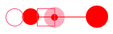
Con estos estilos obtenemos una versión estática de las órbitas, tal y como vemos en esta imagen:
El CSS encargado de hacer la ‘magia’ de posicionar y animar las órbitas es este:
    /* The connection lines */
    .orbit .planet {
      animation-iteration-count:infinite;
          -webkit-animation-iteration-count:infinite;

        animation-timing-function:linear;
          -webkit-animation-timing-function:linear;

        transform-origin: center right;
          -webkit-transform-origin: center right;

        animation-duration:12s;
          -webkit-animation-duration:12s;

        /*  default duration & rotation start position
            for each planet.
            it'll be overwrite for the rest of planet */
        animation-name:orbit;
          -webkit-animation-name:orbit;
    }

      /* settings for rest of planets */
      .orbit .planet:nth-child(2) {
        animation-duration:15s;
        animation-name:orbit2;
          -webkit-animation-duration:15s;
          -webkit-animation-name:orbit2;
      }
      .orbit .planet:nth-child(3) {
        animation-duration:20s;
        animation-name:orbitSmall;
          -webkit-animation-duration:20s;
          -webkit-animation-name:orbitSmall;
      }
      .orbit .planet:nth-child(4) {
        animation-duration:9s;
        animation-name:orbit3;
          -webkit-animation-duration:9s;
          -webkit-animation-name:orbit3;
      }

@keyframes orbit {
  from { transform:rotate(0deg); }
  to { transform:rotate(-360deg); }
}
    @-webkit-keyframes orbit {
      from { -webkit-transform:rotate(0deg); }
      to { -webkit-transform:rotate(-360deg); }
    }

@keyframes orbit2 {
  from { transform:rotate(120deg); }
  to { transform:rotate(-240deg); }
}
  @-webkit-keyframes orbit2 {
    from { -webkit-transform:rotate(120deg); }
    to { -webkit-transform:rotate(-240deg); }
  }

@keyframes orbit3 {
  from { transform:rotate(-160deg); }
  to { transform:rotate(200deg); }
}
  @-webkit-keyframes orbit3 {
    from { -webkit-transform:rotate(-160deg); }
    to { -webkit-transform:rotate(200deg); }
  }

@keyframes orbitSmall {
  from { transform:rotate(-240deg); }
  to { transform:rotate(120deg); }
}
  @-webkit-keyframes orbitSmall {
    from { -webkit-transform:rotate(-240deg); }
    to { -webkit-transform:rotate(120deg); }
  }
CSS animations
Algunas de las propiedades que estamos usando son:
/* number of times that the animation will execute */
animation-iteration-count: number|infinite|initial|inherit;

/* specifies the speed curve of the animation */
animation-timing-function: linear|ease|ease-in|ease-out|cubic-bezier(n,n,n,n)|initial|inherit;

/* start position of animation */
transform-origin: x-axis y-axis z-axis|initial|inherit;

/* how many seconds or milliseconds an animation takes to complete one cycle */
animation-duration: time;

/* name of animation (defined in @keyframes) */
animation-name: name;
Keyframes
Con la regla @keyframes podemos definir como queremos que sean nuestras animaciones.
La animación se crea cambiando una serie de estilos CSS de un estado a otro. Podemos definir tantos keyframes como queramos, definiendo su posición desde 0% (from) a 100% (to). 0% es el comienzo de la animación y 100% es el final.